Corporate security teams face mounting pressure to deliver impactful insights to executive stakeholders. In our latest blog post, we delve into the transformative power of visual analysis, exploring how innovative approaches can revolutionise decision-making processes within corporate security.
When business leaders at Walmart, a leading U.S. retailer, wanted to optimise their store layouts, they could have produced a lengthy written report based on data from security camera footage and store sensors, detailing precisely which aisle each customer visited, how many times and at what time of day. Instead, they used heat map technology, overlaying the data onto a store map. Executives could easily see traffic bottlenecks and opportunities to place high-margin products, and tailor product placement based on local preferences and behaviours.
Heat maps are not new. But the approach underscores two fundamental truths: Our brains process visuals far more efficiently than text. And good visuals can help with critical business decisions.
Yet so many intelligence teams still produce lengthy, text-heavy reports, expecting stakeholders to pay attention and maintain engagement.
That’s why, at Dragonfly, we recently launched a new Visual Analysis section within our Security Intelligence Analysis Service (SIAS) platform. It contains a broad range of visuals, from dashboards to interactive maps, designed to help security teams and senior stakeholders understand critical security intelligence at a glance and enhance decision-making.
But what makes a good visual for security intelligence? And how can you best integrate visuals into your reports, in order to engage the C-Suite and other stakeholders?
Does a picture really speak a thousand words?
The Covid-19 pandemic, the Russian invasion of Ukraine and the Israel-Hamas war have all increased demand for geopolitical analysis and forecasts from senior stakeholders. The result is that corporate security is playing a more visible role in guiding corporate strategy, and is often involved at the highest levels of business decision-making. Yet when presenting to the board and to other senior stakeholders, it can be a struggle to deliver an impactful and engaging analysis that stands out among a slew of other papers.
Conveying detailed information is an art that transcends the mere content of your message. As we have seen in the example above, your choice of delivery can significantly influence the reception and impact of your work.
Visuals play a crucial role in learning and comprehension. Approximately 65% of people are visual learners, which makes sense considering the brain processes visual information 60,000 times faster than text. In less than a tenth of a second, our brains can get a sense of a visual scene, in just one hour our eyes can register 36,000 visual messages and 90% of information transmitted to the brain is visual.
The science behind the cliché is empirical. Images, be they graphics, interactive tools or maps, enable stakeholders to connect and absorb critical information on a more visceral level.
How visuals can be used by corporate security
This is certainly true for corporate security.
Real-time threat assessment and monitoring can be facilitated through visualisations such as heat maps, interactive risk dashboards, network diagrams, charts, maps, infographics and geospatial overlays. By visually depicting areas of risk and potential disruption, security intelligence teams can proactively identify emerging threats and allocate resources accordingly.
Graphics also enable security teams to present incident timelines, impact assessments, security trends and geopolitical intelligence concisely and clearly to senior stakeholders, whose agendas are packed and whose attention is limited.
The result? Faster and better decision-making – be it in response to unfolding security incidents or long-term strategic planning.
Characteristics of Effective Visuals: Case studies
Not all visuals are created equal, though. To be effective, visual communications must:
- Simplify Complexity: Good visuals distil complex data into an easily digestible format, allowing for immediate comprehension without sacrificing depth or nuance.
Example: At the onset of the Israel/Hamas conflict, Dragonfly developed an interactive, customisable crisis map for the area. This tool was more than a situational report; it provided actionable intelligence in real time as part of our ongoing work to monitor the conflict. By collating and presenting critical data on Israel, Palestine (including Gaza and the West Bank), Lebanon, Egypt, Syria and Jordan, organisations could easily identify incidents such as rocket attacks, armed confrontations and the status of border crossings, airports and seaports.
“Our map was based on data that we were collecting in Israel, the occupied Palestine territories and surrounding countries. It was easier to publish that data on the visualisation part of the website at that point because the situation was changing rapidly, and the intel needed to be updated daily. It was a live tool for customers to use,” comments Martin Quick, Dragonfly’s data scientist.

The map’s design, functionality and timely updates exemplify the transformative power of visuals in conveying complex information swiftly and effectively, guiding strategic decision-making processes in high-stakes environments.
- Ensure Relevance and Accuracy: Visuals must represent real objects, meaningful scenarios or data accurately for them to be of any use.
Example: Cyber and digital risks have become an important part of corporate security teams. Dragonfly’s visualisation below delivers up-to-date forecasts on nations poised to enhance or establish offensive cyber capabilities in the near future, as well as those already recognised as active.
Drawing on data from our SIAS assessments and risk scores, the Belfer Centre, the Centre for Strategic and International Studies, the Council on Foreign Relations, the Cyber Policy Portal UNIDIR, and the World Bank, it provides insight into the cyber strengths and projects risk across 44 different countries. Users can interact with the dashboard, using drop-down menus to compare how each country stacks up against one another and what their motives are.
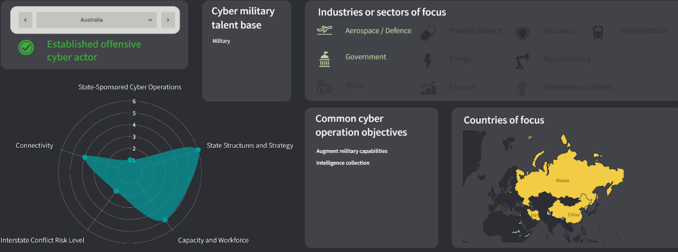
Following its release as part of our Strategic Outlook report, a large airline suggested to us that we make it more widely available due to its importance. We have since incorporated it into our Visual Analysis page, updating the data biannually to ensure the intelligence is both relevant and accurate.
- Facilitate Engagement: Beyond conveying data, effective visuals should engage the audience, making the information compelling and memorable.
Example: This is a busy year for elections and many organisations are concerned about potential security risks tied to these events. Dragonfly developed the interactive map below as a go-to guide for everything election-related in 2024. Users can click on any of the 50 countries gearing up for a national election and uncover details such as when they are happening, type of election, and the potential operational risks organisations might face. We have also added a risk rating for each country to help gauge the situation at a glance, as well as a direct link to that country’s dossier, filled with our latest intelligence reports.

Dragonfly: Delivering Clarity in an Uncertain World
At Dragonfly, we take complex data and world insights, turning them into clear, compelling visuals that are easy to understand. We know how important it is for decision-makers to quickly identify global trends and major shifts, which is why we have launched a new Visual Analysis section within our Security Intelligence Analysis Service (SIAS) platform. A broad range of visuals, from dashboards and interactive maps to the graphics that often accompany our reports are now available to our subscribers. If you have a specific need, our dedicated creative team can even produce bespoke visuals that draw from multiple data sources.
Our graphics do more than show data; they illuminate and give context, transforming raw figures into trusted insights. Every visual is designed to improve decision-making on a day-to-day basis and is regularly updated to maintain relevancy. Our aim is not merely to create attractive visuals, but to curate and aggregate data in ways that significantly enhance its use and relevance. In doing so, you are empowered to engage with stakeholders more effectively, setting a new standard for intelligence communication and decision-making support.
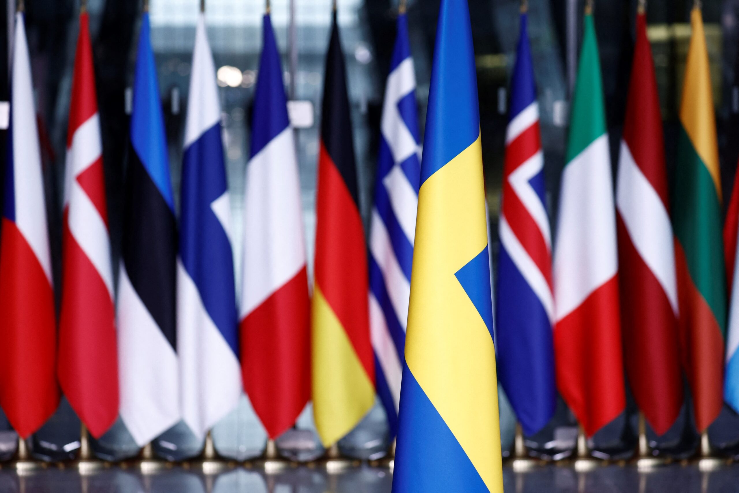
Image: A Swedish flag is seen in front of others before a flag-raising ceremony for Sweden’s accession to NATO at the North Atlantic Alliance headquarters in Brussels, on 11 March 2024. Photo by Kenzo Tribouillard/AFP via Getty Images.